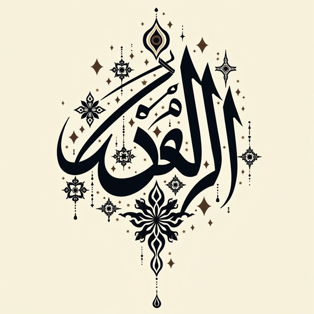
Let me outline all four aspects of developing this cultural poster about حُزْن (sadness):
1. LAYOUT OPTIONS:
- Main composition: Word حُزْن centered, with the ح in Naskh flowing downward
- Placement options:
- Centered composition with text radiating outward
- Asymmetrical placement with weighted bottom
- Diagonal arrangement suggesting descent
- Size variations between letters to create visual hierarchy
- Spacing between letters can be adjusted to show isolation or connection
2. DECORATIVE ELEMENTS:
- Geometric patterns fragmenting around the edges
- Subtle teardrops incorporated into letter extensions
- Dots/diacritical marks stylized for emphasis
- Negative space forming meaningful shapes
- Swirling extensions from letters that fade out
- Shadow effects under certain strokes
3. PROPORTIONS TO CONSIDER:
- Letter height ratios (Naskh ح could be 1.5x larger than Riq'a زن)
- Spacing between letters (can be tight or expansive)
- Thickness variations in strokes
- Balance between positive and negative space
- Scale of decorative elements vs. main text
- Border width vs. text size
4. GEOMETRIC PATTERN INTEGRATION:
- Eight-pointed stars breaking apart at edges
- Interlacing patterns with increasing spaces
- Circular patterns that fragment outward
- Traditional geometric shapes dissolving
- Overlapping patterns creating depth
- Color gradient within patterns from dark to light
- Pattern density varying across the composition, This image explores the concept of حُزْن, representing sadness through intricate Arabic calligraphy. The word is elegantly centered, drawing attention to its emotional weight. Surrounding the word are geometric patterns and decorative elements that complement the central theme. Soft colors and varied letter sizes create an engaging visual experience. The design plays with negative space, enhancing the feeling of isolation. This poster symbolizes cultural expressions of sadness through artistic tradition in Arabic design


