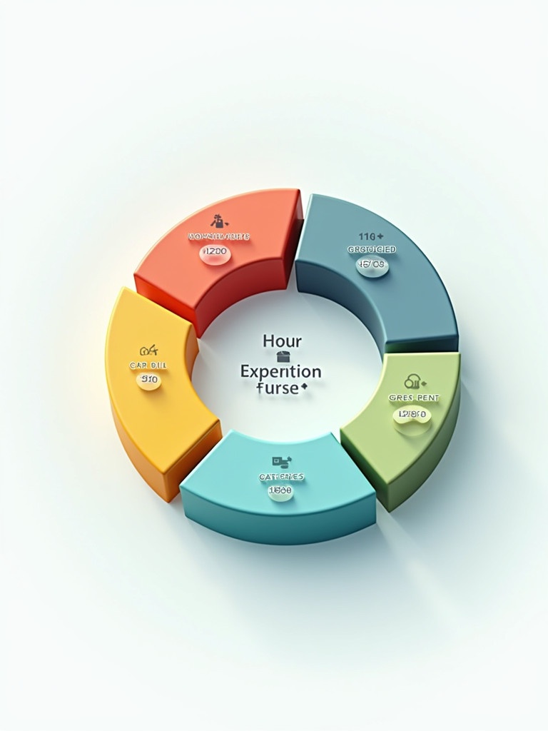
3D Pie Chart Illustration of Monthly Income Expenses Breakdown

Flux Prompt

AI Prompt

More Flux Images About A colorful 3D pie chart depicting various monthly expenses

3D Pie Chart Illustration of Monthly Income Expenses Breakdown and Related Flux Artwork

3D pie chart illustration with five segments. The 42 percent segment is blue. The 26 percent segment is orange. The 21 percent segment is gray. The 10 percent segment is green. The 1 percent segment is red.
O

3D pie chart illustration with five segments. The 42 percent segment is blue. The 26 percent segment is orange. The 21 percent segment is gray. The 10 percent segment is green. The 1 percent segment is red.

The image depicts a colorful and interactive business analytics dashboard designed for financial analysis. It features various charts and graphs that display key performance indicators and trends. Each section provides insights into different aspects of the business, such as revenue, expenses, and market performance. The layout is clean and user-friendly, making it easy to interpret data at a glance. This dashboard is ideal for professionals seeking to make data-driven decisions.
2 images
p

The image depicts a colorful and interactive business analytics dashboard designed for financial analysis. It features various charts and graphs that display key performance indicators and trends. Each section provides insights into different aspects of the business, such as revenue, expenses, and market performance. The layout is clean and user-friendly, making it easy to interpret data at a glance. This dashboard is ideal for professionals seeking to make data-driven decisions.

Colorful interactive business analytics dashboard for financial analysis. Displays various charts and graphs with key performance indicators. Sections provide insights on revenue, expenses, market performance. Layout is clean and user-friendly for data interpretation. Ideal for professionals making data-driven decisions.
C

Colorful interactive business analytics dashboard for financial analysis. Displays various charts and graphs with key performance indicators. Sections provide insights on revenue, expenses, market performance. Layout is clean and user-friendly for data interpretation. Ideal for professionals making data-driven decisions.

A stylized smartphone displaying a 3D financial graph with bars and an upward trend line.

A stylized smartphone displaying a 3D financial graph with bars and an upward trend line.

This image showcases a colorful business analytics dashboard featuring various charts and graphs. It includes metrics such as 'Exit Form starts' and 'Finalizing Untarring' presented visually. The layout is bright and clean, making it easy to interpret the financial data. Each graph represents different data sets, with vibrant colors aiding in differentiation. The overall design reflects modern user interface aesthetics, suitable for business-related applications.
s

This image showcases a colorful business analytics dashboard featuring various charts and graphs. It includes metrics such as 'Exit Form starts' and 'Finalizing Untarring' presented visually. The layout is bright and clean, making it easy to interpret the financial data. Each graph represents different data sets, with vibrant colors aiding in differentiation. The overall design reflects modern user interface aesthetics, suitable for business-related applications.

Close-up view of a financial document. The document features a line graph. A fountain pen is being held above the graph. A pair of eyeglasses is placed nearby. A calculator is visible in the background. The graph shows fluctuations in monthly data points from May to September.
D

Close-up view of a financial document. The document features a line graph. A fountain pen is being held above the graph. A pair of eyeglasses is placed nearby. A calculator is visible in the background. The graph shows fluctuations in monthly data points from May to September.

Budget representation with a chart and stacks of coins. A clipboard features a bar graph indicating budget amounts. The background is a solid color.
v

Budget representation with a chart and stacks of coins. A clipboard features a bar graph indicating budget amounts. The background is a solid color.

This image features a 3D pie chart illustration that represents various types of energy. Each pie segment is uniquely colored, including orange, green, teal, and blue. The chart displays labels and corresponding icons for energy types like 'PVR', 'HPR', and 'Morliest Sealey'. The design is intended for educational and professional use, providing a clear visual representation. The overall style is modern and clean, making it suitable for presentations and reports.
S

This image features a 3D pie chart illustration that represents various types of energy. Each pie segment is uniquely colored, including orange, green, teal, and blue. The chart displays labels and corresponding icons for energy types like 'PVR', 'HPR', and 'Morliest Sealey'. The design is intended for educational and professional use, providing a clear visual representation. The overall style is modern and clean, making it suitable for presentations and reports.

A close-up of a smartphone screen displaying a bullish candlestick chart.

A close-up of a smartphone screen displaying a bullish candlestick chart.

A 3D illustration of a map with a blue, pink, and red location pin.

A 3D illustration of a map with a blue, pink, and red location pin.